COL / 01
Soft Cream
Softer than pure white and more dimensional in natural light, cream creates an airy foundation for sofas, curtains, bedding, rugs, and upholstered surfaces.
FormHaven Design Journal
A room can be quiet and still feel deeply layered. The difference often comes from how color, material, surface, light, and scale work together. Our approach favors warm neutrals, tactile contrasts, natural variation, and enough restraint for every detail to remain visible.
The most inviting interiors rarely depend on one dramatic color. They build character through subtle differences: cream against oak, woven fabric beside smooth ceramic, an aged metal accent against soft upholstery, and daylight moving across every surface.
Palette Architecture
Instead of building rooms around short-lived statement colors, we prefer tones that respond beautifully to natural materials and changing light. The result is flexible enough to evolve and distinctive enough to feel considered.
Softer than pure white and more dimensional in natural light, cream creates an airy foundation for sofas, curtains, bedding, rugs, and upholstered surfaces.
Stone-inspired neutrals add definition without becoming severe. They work especially well across rugs, upholstered seating, wall art, and supporting furniture.
Honey, walnut, and softly smoked wood tones introduce warmth through grain rather than flat color, making tables, dressers, and bed frames feel visually grounded.
Olive introduces a natural accent without breaking the calm of a neutral room. It pairs easily with wood, cream textiles, aged metal, botanical forms, and warm stone.
Used in small amounts, charcoal sharpens the room. Thin frames, lamp details, hardware, and graphic art can bring structure without overwhelming a softer palette.

Depth Without Clutter
A neutral room becomes interesting when surfaces behave differently. Bouclé catches light in small irregular shadows. Linen softens it. Wood reflects warmth through grain. Ceramic absorbs light while glazed surfaces return it.
This means a room does not need many competing colors to feel rich. A sofa in warm ivory can sit beside a walnut coffee table, a woven area rug, a ceramic vase, and a linen curtain while every element remains clearly distinct.
The restraint is intentional. Fewer color interruptions allow silhouette, construction, surface, and proportion to become more noticeable.
Texture Library
Texture works best when each material performs a different visual role. The goal is not to maximize contrast, but to create enough variation for the room to feel layered from across the space and interesting at close range.
Soft loops break up broad upholstered surfaces and make larger sofas, beds, and occasional seating feel warmer, more relaxed, and less visually rigid.
Sofas / BedsLinen brings softness without heaviness. Its natural irregularity works particularly well in curtains because folds and daylight create constant tonal variation.
Curtains / TextilesDense woven texture grounds furniture visually and adds comfort underfoot. In an area rug, it also creates a transition between larger furniture forms and the floor.
Area RugsWood introduces movement through visible grain and tonal variation. It is especially effective when larger pieces need to feel grounded but not visually flat.
Tables / DressersMatte, glazed, carved, or subtly imperfect ceramic surfaces bring small-scale tactility to tables, shelves, dressers, and quiet decorative compositions.
Vases / AccentsMetal brings precision and controlled reflectivity. Used selectively in lamps, frames, legs, and decorative objects, it sharpens softer materials around it.
Lamps / DetailsMaterial Pairing System
A room gains depth when adjacent materials do not behave exactly the same. Pair softness with structure, matte surfaces with subtle reflection, and organic texture with cleaner architectural lines.
Pale upholstery creates softness while darker wood provides visual weight. The contrast is warm rather than sharp, making it ideal for sofas paired with coffee tables, side tables, or nearby dressers.
Relaxed linen becomes more architectural beside thin dark frames, lamp details, or hardware. The charcoal should act as punctuation rather than become the dominant field.
A woven rug gives tactile depth beneath clean furniture surfaces. The combination works especially well beneath dining tables, coffee tables, and substantial living-room seating.
Matte ceramic and softly reflective metal create an elegant small-scale contrast. Use the combination across vases, bowls, lamps, and decorative accents rather than in large quantities.
Muted green feels natural beside stone-inspired neutrals. It works through plants, selected upholstery, decorative vessels, wall art, and small textile accents.
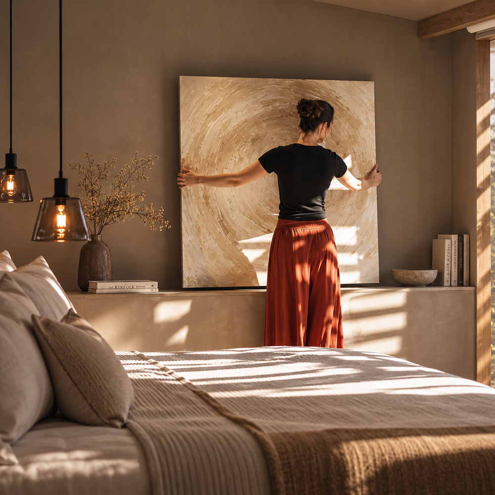
Expressive wall art becomes more powerful when the surrounding furniture and finishes remain restrained. Give visual focal points enough negative space to breathe.
Light Is a Material
Color is never completely static. Cream upholstery can appear crisp in morning light, golden in late afternoon, and intimate under a table lamp. Wood becomes richer as shadows deepen. Metal can nearly disappear until it catches a warm reflection.
Curtains are particularly important because they edit daylight before it reaches everything else. A softer fabric can reduce glare while preserving brightness, allowing upholstery, rugs, and wall art to retain more nuanced color throughout the day.
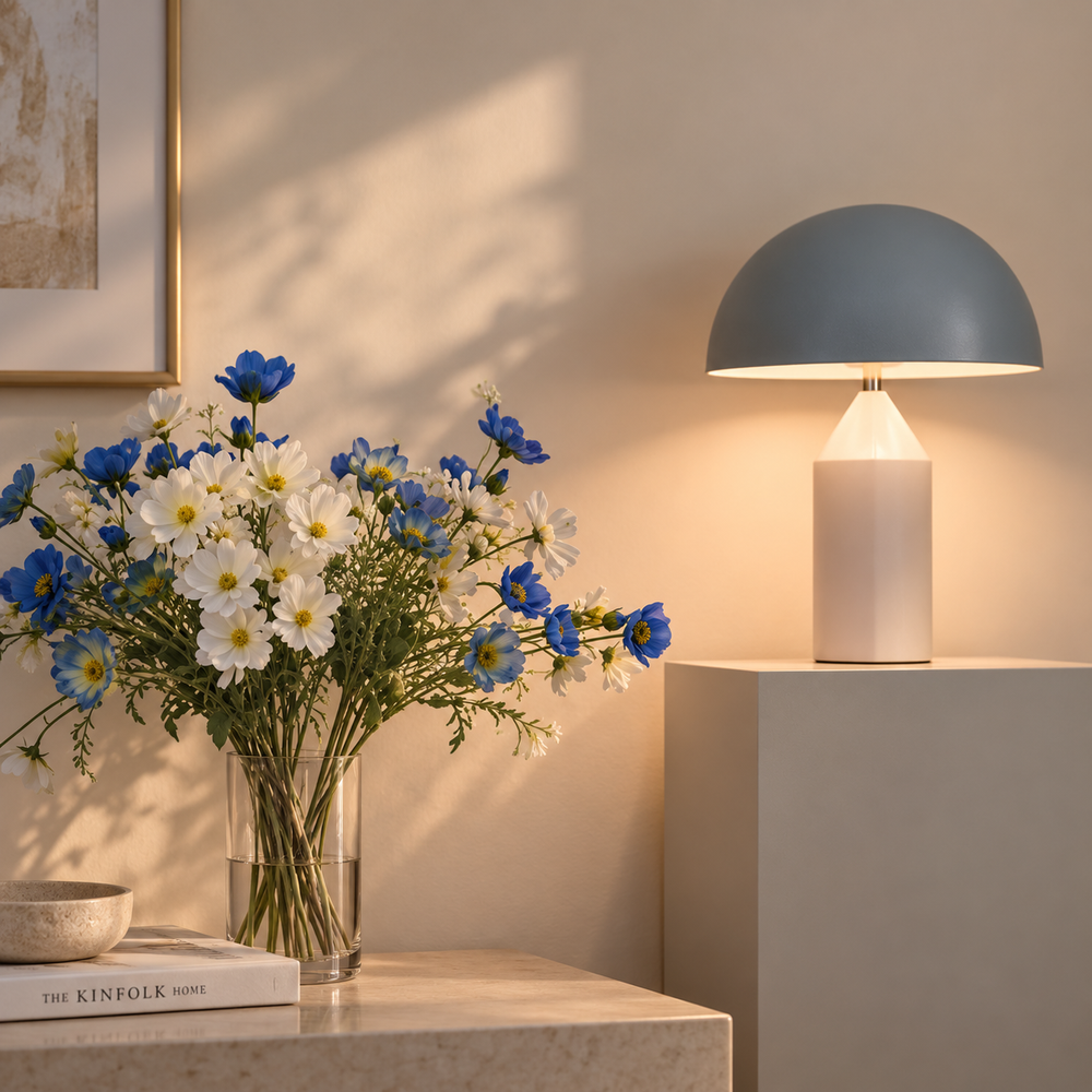
In the evening, smaller light sources become essential. Table lamps create localized warmth that emphasizes texture and turns broad rooms into smaller, more inviting zones.

Room Application
Color and texture should respond to the function of the room. Spaces for gathering can carry more contrast and movement, while bedrooms often benefit from quieter transitions, softer surfaces, and fewer visual interruptions.
Begin with the sofa and area rug as the dominant soft surfaces. Add wood through the coffee table, controlled contrast through lighting, and smaller sculptural moments with vases and wall art.
Let the dining table provide the strongest material note. A textured rug can soften the arrangement, while wall art and vases create vertical and sculptural contrast without crowding the tabletop.
Reduce contrast and increase softness. Upholstered beds, curtains, quiet rugs, and warm wood dressers create a layered environment without introducing unnecessary visual stimulation.
Smaller spaces benefit from one strong material relationship. A dresser or console can anchor the area while wall art, a vase, and a lamp create enough variation to make the transition into the home feel intentional.
Prioritize touch and localized light. A soft seat, tactile rug, warm lamp, and one nearby wood surface can create intimacy without requiring a large footprint.
Use a consistent material vocabulary across zones. Repeating related wood tones, textiles, and accent colors helps the living and dining areas feel connected without making every object match.
Product Roles
Every category contributes differently. Understanding that role makes it easier to build a room gradually instead of trying to solve the entire space with one purchase.
Establish the largest upholstered color field in the room. Neutral sofas allow cushions, rugs, wood, lighting, and decorative accents to evolve around them.
Introduce structure and material contrast at the center of the seating area, especially through wood grain, stone-inspired surfaces, or restrained metal details.
Carry a broad material surface that can visually connect dining chairs, rugs, wall art, lighting, and decorative objects across the entire dining zone.
Establish softness and quiet scale. Upholstered silhouettes work especially well with warm woods, woven curtains, and restrained bedside lighting.
Bring horizontal structure and storage while creating a surface for smaller textural compositions involving lamps, vases, books, and wall art.
Introduce room-scale texture underfoot. Rugs can connect several furniture pieces visually and soften harder materials such as wood flooring and tables.
Add sculptural shape and smaller areas of material contrast. Ceramic, metallic, and textured vessels can shift the character of a surface without changing the furniture.
Add vertical softness while changing the quality of natural light. Their color and weave influence every nearby surface throughout the day.
Introduce material contrast at eye level and create concentrated pools of warm light that reveal texture differently after sunset.
Bring controlled color and composition to vertical space. Art can become the strongest visual note in a neutral room without requiring additional decorative clutter.
Styling Principles
These are not rigid formulas. They are useful filters for deciding when to add, remove, repeat, or contrast a color or material.
Let a wood tone, metal finish, or muted color appear more than once, but avoid repeating it identically everywhere. Variation keeps the room collected rather than coordinated.
Upholstery, curtains, and rugs benefit from the contrast of clean tables, defined frames, or disciplined furniture silhouettes. Too much softness can make a room lose shape.
Negative space allows texture and color to register. A beautiful vase, lamp, or artwork becomes more distinctive when the surrounding surface is not completely filled.
A palette that only works in daylight is incomplete. Evaluate how upholstery, wood, wall art, rugs, and metal finishes respond to the table lamps you actually use.
FormHaven Service Standard
Choosing pieces for a room should feel clear and supported. Our operating standards are designed to make the practical side of furnishing your home more straightforward.
Our customer support team is available around the clock for product, order, delivery, and general shopping questions.
Free shipping is provided on all products across the FormHaven assortment.
Orders are typically delivered within three to five business days.
Selected pieces are available at 20% off while remaining part of the same considered furniture and decor assortment.
Free returns and exchanges are available within 30 days, giving you added confidence after your order arrives.
A room does not need more color to feel richer. Sometimes it simply needs better relationships between what is soft, what is structured, what reflects light, and what quietly absorbs it.
Practical Guidance
Simple answers for building a warmer, more cohesive home without relying on exact matching or overly complicated decorating rules.
There is no fixed number, but a restrained base usually creates more flexibility. Begin with one or two dominant neutral families, then add smaller accents through greenery, wall art, vases, lamps, books, or textiles. Repeating related tones in different materials creates cohesion without making the room look overly matched.
Yes. The combination often becomes more natural when another material connects them. Warm wood, woven rugs, ceramic objects, and soft textiles can bridge cream, taupe, gray, stone, and muted green without forcing every surface into the same undertone.
Keep the color story relatively controlled and vary the surfaces instead. A woven rug, smooth wood table, soft upholstered sofa, linen curtain, ceramic vase, and restrained metal lamp can provide substantial depth while remaining visually calm.
They do not need to match exactly. Related warmth and visual weight matter more than identical finish. Slight variation in tone can make a room feel more collected, especially when the wood pieces are separated by upholstery, rugs, or other softer materials.
Start with smaller pieces that can be repeated naturally. A vase, wall artwork, plant, decorative object, or textile accent can introduce a new tone without requiring changes to the major furniture in the room.
Consider the existing floor, wall tone, natural light, nearby wood, and the size of the furniture surface. A sofa introduces far more color than a small vase, so larger pieces generally benefit from versatile tones that can support future changes elsewhere in the room.
Yes. FormHaven customer support is available 24/7 for questions about products, sizing, orders, delivery, and general guidance when comparing pieces for your home.
Need Help Comparing Pieces?
If you are comparing upholstery, wood tones, rugs, lighting, decorative accents, or proportions for a specific room, our support team is available 24/7 to help with product and order questions.
